A Tidbyt is a small 64×32 LED display designed to surface small "tidbits" of information from different apps: weather, transit departures, sports scores, etc. Its small footprint affords very little space for information, making every pixel and every second of attention count.
What started as a quick fix for a limitation in the default calendar app became an opportunity to explore how a complex set of rules could produce an experience that feels simple, immediate, and almost effortless.
When I started working on HelloCal, I was just trying to address a small frustration. I wanted to display my family's shared Google calendars on a Tidbyt, a small, whimsical pixel display designed to surface useful information at a glance. The official calendar app only supported a primary calendar, which wasn't useful on a shared family device. The alternatives weren't much better: one regularly showed a crossed-out cloud icon, while another rendered nothing more than an empty clock.
The first version was little more than a proof of concept, fetching a private iCal URL and displaying the next event.
The problem wasn't that I wanted a better calendar app. I simply wanted one that worked. A few years ago, I probably would have accepted that limitation and created a separate Google account to host the family calendar. Instead, I sat down at my laptop, cranked up Claude Code, and started thinking about the app I wanted.
I didn't begin by sketching a new interface or documenting use cases. I needed something that worked, and within an hour I had a functioning first version.
It wasn't polished. It fetched a private iCal URL and displayed the next event. But it worked, and for the first time I could see my secondary calendar on the device. That small success changed the project completely. Instead of asking whether I could build it, I found myself asking how good I could make it.
The first version was the easy part
The original app was little more than a proof of concept, but living with it quickly got my designer brain going. I started seeing potential improvements everywhere.
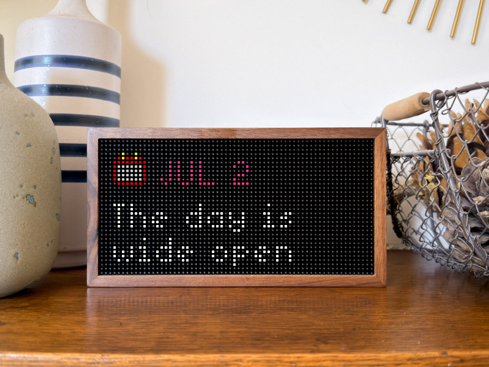
Some days there were no events at all. Showing the standard "nothing left for today" message didn't capture the joy of a day filled with possibility, so I sat down with my faithful AI companion and brainstormed a collection of calmer, more uplifting messages.
On quiet days, HelloCal shows one from a series of reflective messages instead of a generic empty state.
More opportunities presented themselves. A 14-hour flight could occupy the display all day, pushing shorter meetings out of view. Multiple overlapping events competed for attention. Recurring events turned out to be far more complicated than they first appeared. A recurring street-cleaning reminder appearing on the wrong day was enough to send me down a rabbit hole I hadn't anticipated.
And what about the last day of the year? Didn't it deserve more than a standard "all done"? A small Easter egg worked its way into the app, with fireworks to boot.
A small Easter egg marks the last day of the year with fireworks.

I became the designer, the builder, the researcher, and the user.
Every improvement came from using the app myself. Rather than following a predefined feature roadmap, the product evolved through dozens of small observations about how information should behave when someone only looks at it for a second or two.
Solving these problems wasn't about implementing calendar standards for their own sake. It was about deciding what someone actually needs to know when they glance across a room. Gradually, the project shifted from displaying calendar data to communicating the right information at the right moment.
The display imposed unusual constraints: everything had to fit inside a 64×32 pixel matrix. Every design decision therefore had to justify itself. Pixel-level refinements continued long after the basic layout worked, because moving a character by even a single pixel could improve readability.
The behaviour evolved alongside the visuals. Events already in progress should display "Now" rather than their original start time and all-day events should display "Today". After 8 p.m., tomorrow's events begin appearing automatically, keeping the display useful into the evening and helping the household prepare for the next day.
Keeping it running
Building the app was only part of the project. Keeping it current became another design problem.
The earliest versions regenerated the display every five minutes. That worked, but most refreshes changed nothing—and a fixed interval could still miss the moments when the display genuinely needed to update.
Running the app myself through GitHub also introduced limits on how frequently it could render without incurring costs. I needed a system that could remain responsive without constantly rebuilding the same screen.
The eventual solution was a scheduling system that identifies the meaningful moments when the display should change: shortly before an event, when an alert should appear, when the event begins, when it ends, or when another event becomes more relevant. A lightweight background check keeps that schedule synchronized whenever the calendar changes.
The display now refreshes because something meaningful has happened, not simply because another five minutes have passed.
The scheduling system triggers updates at meaningful moments, such as shortly before an event begins.
The deployment model evolved in parallel. Local rendering became GitHub Actions, followed by scheduled automation and eventually multi-device configuration, allowing my two Tidbyts sitting in different rooms to subscribe to different combinations of calendars.
From a personal tool to a public one
The project began as something I built entirely for myself. As it became more polished, it felt worth sharing. I made the repository public, documented the installation process, and submitted the app to the Tidbyt community store. The automated checks passed and the required contributor agreement was completed, but the community repository has been inactive after an acquisition (so says Reddit) and the submission hasn't been reviewed so far.
HelloCal therefore remains in an unusual limbo: ready for the store, but unlikely to arrive there through the existing process. It is nevertheless available for anyone to install—with a little time and a willingness to get their digital hands dirty.
HelloCal on a Tidbyt, showing the next upcoming event at a glance.
Designing differently
HelloCal started as an attempt to work around the limitations of a product I couldn't control, but it ended up changing something much more fundamental: the way I design.
For most of my career, the design process stopped at increasingly convincing representations of a product. First wireframes, then polished mockups, then interactive prototypes. Each iteration brought me closer to understanding the experience, but there was always a point where I had to imagine what using the finished product would actually feel like.
HelloCal was different. Once the first version worked, every design decision happened inside the finished product itself. I wasn't evaluating screens or prototypes anymore—I was living with the app and evaluating the product. I noticed when information appeared too early, when it stayed too long, when colours didn't read well from across the room, or when a recurring event behaved in an unexpected way. I became the designer, the builder, the researcher, and the user. Every day with the app generated another round of feedback and another opportunity to improve it.
That has fundamentally changed what I enjoy about designing in my spare time. Instead of imagining products that might exist one day, I can build them, use them, discover what's actually wrong with them, and refine them while they become part of my daily life.
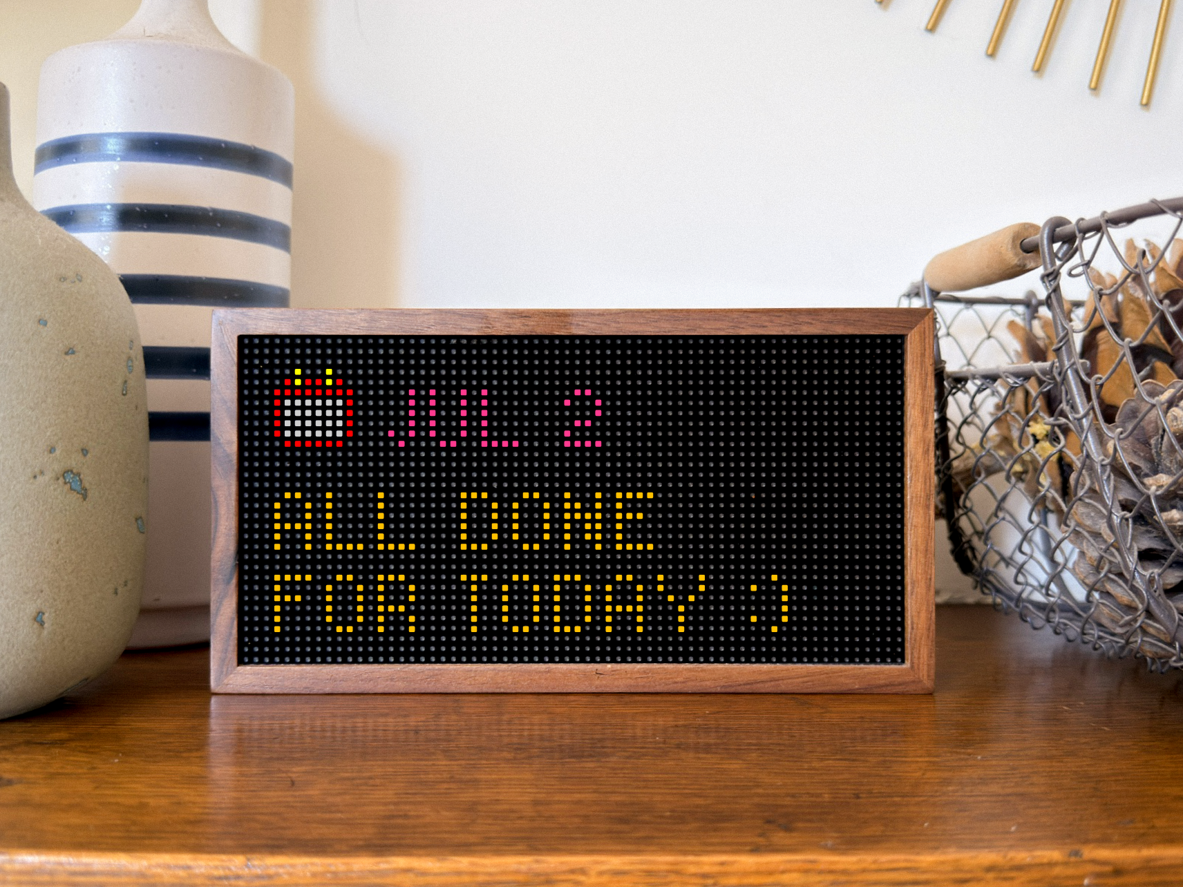
A calm take on the end-of-day message borrowed from the official app.